OMT architects - Web API Documentation
Function overview for custom OMT webpage. Please beware, any custom changes are not inside this documentation.Helper Classes
Grid
The grid system can adapt across all six default breakpoints. The six grid tiers are as follow:
- Extra small (xs)
- Small (sm)
- Medium (md)
- Large (lg)
- Extra large (xl)
- Extra extra large (xxl)
As noted above, each of these breakpoints have their own container, unique class prefix, and modifiers. Here’s how the grid changes across these breakpoints:
|
xs <576px |
sm ≥576px |
md ≥768px |
lg ≥992px |
xl ≥1200px |
xxl ≥1400px |
|
|---|---|---|---|---|---|---|
Container max-width |
None (auto) | 540px | 720px | 960px | 1140px | 1320px |
| Class prefix | .col- |
.col-sm- |
.col-md- |
.col-lg- |
.col-xl- |
.col-xxl- |
| # of columns | 12 | |||||
Grid Example
  <div class="row">
    <div class="col">col</div>
    <div class="col">col</div>
    <div class="col">col</div>
    <div class="col">col</div>
  </div>
  <div class="row">
    <div class="col-8">col-8</div>
    <div class="col-4">col-4</div>
  </div>
Show and Hide
Containers are the most basic layout element in Bootstrap and are required when using our default grid system. Containers are used to contain, pad, and (sometimes) center the content within them. While containers can be nested, most layouts do not require a nested container.
For grids that are the same from the smallest of devices to the largest, use the .col and .col-* classes. Specify a numbered class when you need a particularly sized column; otherwise, feel free to stick to .col.
Don’t want your columns to simply stack in some grid tiers? Use a combination of different classes for each tier as needed. See the example below for a better idea of how it all works.
|
Extra small <576px |
Small ≥576px |
Medium ≥768px |
Large ≥992px |
X-Large ≥1200px |
XX-Large ≥1400px |
|
|---|---|---|---|---|---|---|
.container |
100% | 540px | 720px | 960px | 1140px | 1320px |
.container-sm |
100% | 540px | 720px | 960px | 1140px | 1320px |
.container-md |
100% | 100% | 720px | 960px | 1140px | 1320px |
.container-lg |
100% | 100% | 100% | 960px | 1140px | 1320px |
.container-xl |
100% | 100% | 100% | 100% | 1140px | 1320px |
.container-xxl |
100% | 100% | 100% | 100% | 100% | 1320px |
.container-fluid |
100% | 100% | 100% | 100% | 100% | 100% |
<div class="container">
  <!-- Stack the columns on mobile by making one full-width and the other half-width -->
  <div class="row">
    <div class="col-md-8">.col-md-8</div>
    <div class="col-6 col-md-4">.col-6 .col-md-4</div>
  </div>

  <!-- Columns start at 50% wide on mobile and bump up to 33.3% wide on desktop -->
  <div class="row">
    <div class="col-6 col-md-4">.col-6 .col-md-4</div>
    <div class="col-6 col-md-4">.col-6 .col-md-4</div>
    <div class="col-6 col-md-4">.col-6 .col-md-4</div>
  </div>

  <!-- Columns are always 50% wide, on mobile and desktop -->
  <div class="row">
    <div class="col-6">.col-6</div>
    <div class="col-6">.col-6</div>
  </div>
</div>
Hiding Elements
To hide elements simply use the .d-none class or one of the .d-{sm,md,lg,xl,xxl}-none classes for any responsive screen variation.
To show an element only on a given interval of screen sizes you can combine one .d-*-none class with a .d-*-* class, for example .d-none .d-md-block .d-xl-none .d-xxl-none will hide the element for all screen sizes except on medium and large devices.
| Screen size | Class |
|---|---|
| Hidden on all | .d-none |
| Hidden only on xs | .d-none .d-sm-block |
| Hidden only on sm | .d-sm-none .d-md-block |
| Hidden only on md | .d-md-none .d-lg-block |
| Hidden only on lg | .d-lg-none .d-xl-block |
| Hidden only on xl | .d-xl-none .d-xxl-block |
| Hidden only on xxl | .d-xxl-none |
| Visible on all | .d-block |
| Visible only on xs | .d-block .d-sm-none |
| Visible only on sm | .d-none .d-sm-block .d-md-none |
| Visible only on md | .d-none .d-md-block .d-lg-none |
| Visible only on lg | .d-none .d-lg-block .d-xl-none |
| Visible only on xl | .d-none .d-xl-block .d-xxl-none |
| Visible only on xxl | .d-none .d-xxl-block |
Website Functions
Slideshow Front-End (Home)
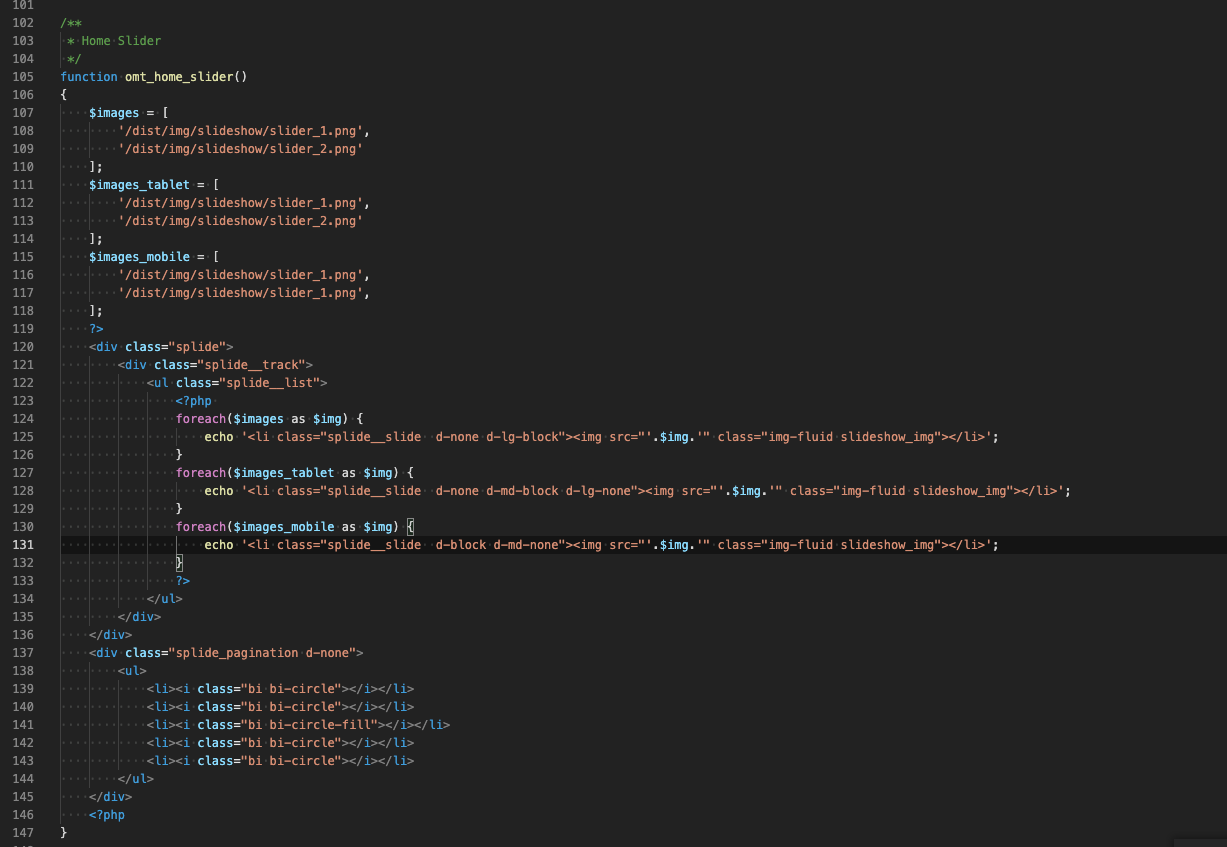
To use the Large Slide Show, the PHP function omt_home_slider must be called. In the API file the images can be assigned (see screenshot below).
Regular Slideshow (Responsive)
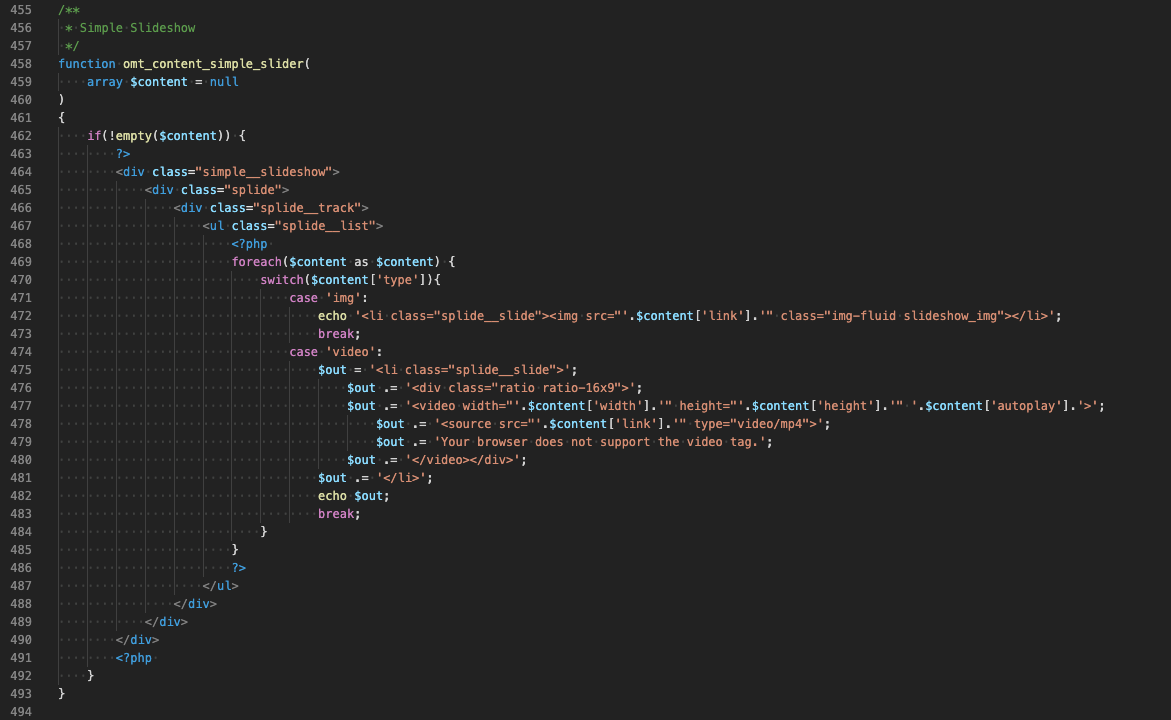
A simple slideshow is included with the omt_content_simple_slider function. The URLs of the images must be passed as an array.
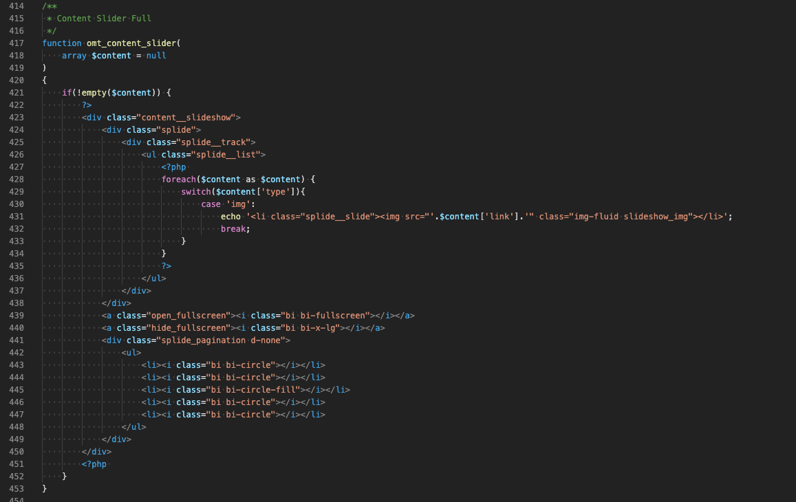
Full-Height Slideshow (Work Single View)
Include the full-height slideshow with the omt_team function. The URLs of the images must be passed as an array.
Team Images
Include the team overview with the omt_team function. The data is managed in the API file.

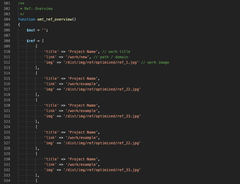
Work overview
Include the work overview with the omt_ref_overview function. The data is managed in the API file.